 Hi Boox Popular Magazine 2025

1. Python
Without a doubt, Python is one of the best languages for Data Science & Visualisation. If you are planning to learn only one language, data science, then it should be Python.
Python’s object-oriented design allows data scientists to carry out operations with more stability, modularity, and code readability. While Data Science is only a minor part of the Python environment, it is rich in specialized machine learning libraries and popular tools such as sci-kit-learn, Keras, and TensorFlow. Without question, Python empowers data scientists.

Why Python
Python is a human-readable, easy-to-learn programming language used for complex data munging, analysis, and visualization. It is straightforward to install and set up, and it is easier to understand. Python is available for Mac, Windows, and UNIX.
Data Visualization
Matplotlib, plot.ly, and nbconvert to convert Python files to HTML pages spell out stunning graphs and dashboards to assist Data Scientists in expressing their results with power and elegance.
2. Language R

R is a free, open-source language that enables Data Scientists to work with a wide range of operating systems and platforms. This technology’s main strength is statistics. R is more than simply a language; it’s a whole environment for doing statistical calculations. It makes it easier to do data processing, mathematical modeling, and data visualization activities with built-in functions.
Why R?
Furthermore, R’s data visualization capabilities are slightly more complex than Python’s, and it is typically simpler to create. Python is a language that is much easier for novices to learn.
R was created mainly for statistical computing, and as a result, it offers a more extensive selection of open-source statistical computing tools than Python.
Data Visualization
R is a robust environment suitable for scientific visualization, with several tools specialize in graphical data visualization outcomes. With the graphics module, we can create basic visuals, charts, and plots. The visualization may also be exported in image formats like jpg. or as individual PDFs. ggplot2 is extremely useful for sophisticated plots such as complicated scatter plots with regression lines.
3. Java
Java is one of the old object-oriented programming languages today for both programming and business development. The bulk of popular Big Data technologies, such as Hive, Spark, and Hadoop, are developed in Java. Weka, Java-ML, MLlib, and Deeplearning4j are just a few of the Data Science libraries and tools available in Java that you may not be aware of.
Why Java?
Although Java may not appear to be a primary language for data science, it is one of the top programming languages for data science due to data science frameworks such as Hadoop that operate on the Java Virtual Machine (JVM).
Hadoop is a well-known data science platform used to manage data processing and storage for large data applications. Hadoop allows for the storing and processing of enormous amounts of data due to its capacity to handle an infinite number of jobs at once.
To summarise, Java is one of the most acceptable data science programming languages to learn if you want to use the Hadoop framework’s capabilities.
4. Scala

Scala is a high-level language. It combines object-oriented and functional programming. This language was initially designed for the Java Virtual Machine (JVM), and one of Scala’s benefits is that it makes interacting with Java code relatively simple.
Why Scala?
Apache Spark is the primary reason to study Scala for Data Science. Scala is helpful for Data Scientists when used in combination with Apache Spark to cope with massive data volumes (Big Data).
Many high-performance data science frameworks built on top of Hadoop are often written in and employ Scala or Java.
Scala’s only disadvantage is its steep learning curve. Furthermore, because the community is small, it becomes laborious to seek solutions to queries on our own in the event of problems.
Scala is ideal for applications when the volume of data is adequate to fully fulfill the technology’s capabilities.
5. MATLAB
When it comes to executing complex mathematical calculations, consider MATLAB to be the most significant programming language. While Data Science is heavily reliant on mathematics, it is a robust tool for mathematical modeling, image processing, and data analysis.
Why MATLAB?
It has a sizable mathematical function library for linear algebra, statistics, Fourier analysis, filtering, optimization, numerical integration, and ordinary differential equations. MATLAB has built-in visuals for data visualization as well as capabilities for building custom charts.
6. Julia
Julia works with data quicker than Python, JavaScript, Matlab, R and is somewhat slower than Go, Lua, Fortran, and C. Technology’s strength is numerical analysis, but Julia can also handle general-purpose programming.
Why Julia?
Julia is quicker than other scripting languages, allowing Data Scientists to create Python/MATLAB/R quickly while creating shortcodes.
Multidimensional data loading is rapid with the Julia data environment. In parallel, it conducts aggregations, joins, and preprocessing procedures.
Julia provides several mathematics libraries, data manipulation tools, and general-purpose computer packages. Integrations with libraries from Python, R, C/Fortran, C++, and Java are also quite simple.
7. Perl

Perl is a set of two high-level, general-purpose, dynamically interpreted programming languages. Perl can handle data queries considerably more effectively since it is based on lightweight arrays that don’t require much attention from the programmer.
Why Perl?
It has a lot in common with Python, a dynamically typed scripting language, because of its adaptability as a general-purpose programming language. Perl is used in quantitative disciplines such as biology, finance, and statistics.
Perl maps or reduces gigabytes of data with simple, maintainable architecture by coordinating large-scale data insertion and querying. The goal of Perl 6 is to create a modular, pluggable architecture that allows for flexibility and customization in Big Data management.
Data Visualization Best Practices
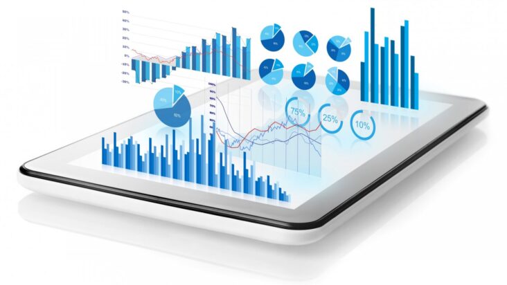
However, to guarantee that your data is as simple to comprehend as you intend, you must adhere to specific rules.
I’ve detailed the top ten data visualization best practices, so you can get started making visually appealing and informative charts, graphs, infographics, and more.
1. Ensure that your data is clean
It would be best to verify that the dataset you use has been adequately cleaned before converting it to a graphical format. The act of weeding out any abnormalities or errors in your dataset is known as data cleansing. It is important to use the data for another purpose since these errors might also distort the findings of your data interpretation. Also if you are using source control like Git make sure you are following Git best practices for high standards. Visit this website to know all you need.
2. Label Your Chart Properly
Graphs and charts can help us rapidly spot trends in your data. On the other hand, labels are the most excellent method to express specific values that may be significant graphically.
You can’t explain everything using only the picture, whether you’re describing an experimental setting, introducing a new model, or presenting new data.
3. Highlight the Crucial Points

When it comes to data visualization, the audience must be able to follow the story you’re attempting to tell simply by glancing at your chart. This is why it is critical to draw the reader’s attention to specific visual signals such as reference lines or highlighted trends.
For example, if you want to communicate information in a language that reads from left to right, ensure your data visualization follows suit.
When using many graphs in a single infographic, ensure the ordering is accurate and the data relationships are transparent. This prevents the audience from being perplexed as they go from one chart to the next.
4. Use different Color
Color may be a valuable tool in data visualization since you can successfully express crucial information about your data using different color combinations.
Categorical data, for example, is best represented by a different color for each category, whereas different shades of a single hue can sort sequential data. Consider if the various hues will conflict or complement one another. If a map contains more than seven colors, consider utilizing another map or grouping categories together.
5. Open for Feedback
Data visualization is the process of converting complex data into a more straightforward visual representation that may give context and tell a story.
The most excellent method to ensure efficient communication through this medium is to provide the audience with just enough information while keeping your approach basic and easy to grasp.
Sharing your visualizations with colleagues and acquaintances is a great way to get their feedback and enhance the visualization based on their ideas.
These IT skills are in high demand. Hope it will help you to start your career in Data Visualization.